
The back-to-back Bush and Obama administrations allow us to easily compare the effectiveness of liberal and conservative economic policies. President George W. Bush's record is highlighted by tax cuts largely aimed at giving the wealthiest Americans more money with which to invest, and a looser regulatory regime on businesses. President Obama implemented the Keynesian-style American Recovery and Reinvestment Act (also known as "the stimulus"), repealed the heart of the Bush tax cuts, greatly expanded the federal government's role in health care with the Affordable Care Act, and tightened regulations on several industry sectors including finance and energy.
How do their economic records compare?
Let's start with the big one: jobs. And let's make it fair to Republicans and only look at private sector job creation – no Democratic cheating by putting all the unemployed on the government payroll!
Bush vs. Obama: Private Sector Job Creation
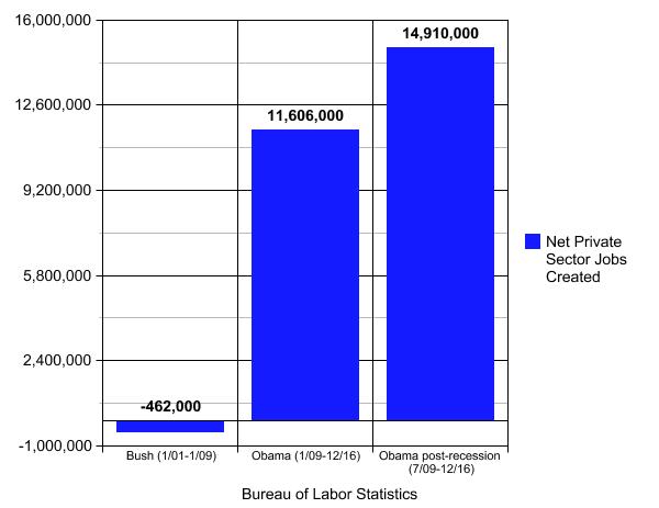
Bush lost private sector jobs over the course of his eight years (the Wall Street Journal declared it the "Worst Track Record On Record" on jobs), while Obama has created a net of 11.6 million private sector jobs during his presidency, and nearly 15 million if you start counting after the Great Recession Bush handed Obama technically ended in mid-2009.
Bush vs. Obama: Unemployment Rate
Similarly, while Bush's policies drove up the unemployment rate, Obama's has pushed it down.
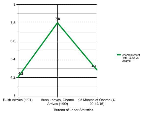
The above, like the other line chart below, is a simplified graph that removes all month-to-month fluctuations during their presidencies, to clarify the bottom line.
Now sometimes reductions in the unemployment rate are dismissed, because the lower percentage comes from unemployed people giving up and leaving the workforce instead of getting a job. In turn, analysts often look at the "employment-population ratio" to see what percent of our population is actually working. But the steady increase in job creation over the last year has begun to lift the employment-population ratio as well.
Under Bush, the employment-population ratio dropped 3.8 percentage points, from 64.4 percent to 60.6 percent. Under Obama, it fell another 2.4 percentage points by October 2013, but since has regained two-thirds of that loss and now sits at 59.7 percent, slightly short of where Bush left off. But the second-term trajectory has been slowly upward, and the net loss of 0.9 percentage points is 2.9 points better than his predecessor.
Again, Obama's overall record bests Bush's ... lest you thought Bush's near-doubling of the unemployment rate was due to millions of people rushing to get back into the job hunt.
Bush vs. Obama: Corporate Profits
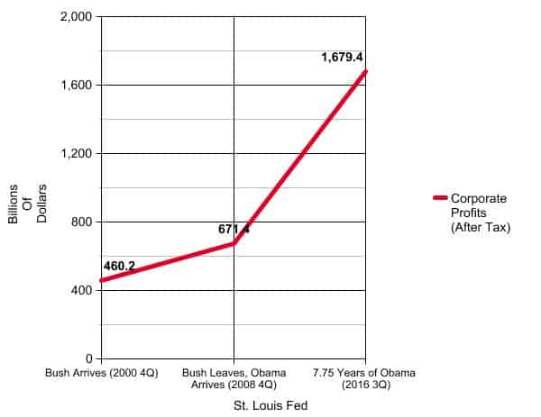
The earlier versions of this "3 Simple Charts" post noted that looking at corporate profits might seem off-base when the middle class is still struggling. But now we have a bonus fourth chart...
Bush vs. Obama: Household Income
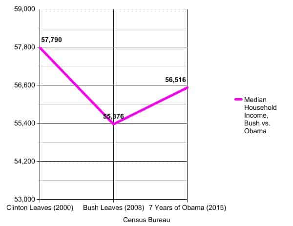
Median household income was down 4.2 percent on Bush's watch and then another 4.9 percent during Obama's first term.
But median household income leaped 5.2 percent in 2015 (see Table H-5 on this Census Bureau page of household income data), giving Obama a net increase versus Bush's net decrease.
Also, average hourly earnings of private sector employees have risen, though slowly, up 17 percent during the course of Obama's presidency. The other silver lining for the middle class is that inflation has been lower under Obama than Bush so wages haven't lost much purchasing power.
Still, a big debate awaits us on how we further improve wage growth to ensure middle-class prosperity. Considering that under Bush, corporations did worse than under Obama, household income still fell and private sector jobs were lost, perhaps conservative economic policies should not be our North Star.
Note: This post was originally published on August 18, 2014. It has been rewritten several times since using updated statistics.
