
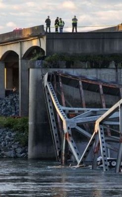
An aging bridge fell down outside of Seattle the other day. This shocked people. But a few people were expecting it because they have been keeping track of how our country's "infrastructure" is aging. The American Society of Civil Engineers has put out their 2013 Report Card on America's Infrastructure, that "depicts the condition and performance of the nation’s infrastructure."
The condition and performance of our infrastructure is D+ and it will cost $3.6 trillion to bring it back to where it should be, because many in our Congress say fixing our infrastructure is "just more government spending" and have been putting it off to "save money." They say our priority should be to fix our deficit problem. (Except the deficit is already down by more than half, falling at the fastest rate since WWII.)
From the report:
- One in nine of the nation’s bridges are rated as structurally deficient.
- The average age of the nation’s 607,380 bridges is currently 42 years.
- to eliminate the nation’s bridge deficient backlog by 2028, we would need to invest $20.5 billion annually, while only $12.8 billion is being spent currently.
And that's just bridges. We face similar problems with dams, roads, schools, water systems, sewer systems, airports, rail and other transportation systems, public parks, ports, energy generation and delivery systems, levees ...
And that's just infrastructure. We have other problems that have gone unaddressed since ... well, since the big corporations took control of the government.
Let's Put The Big Problems In People's Faces
We have a number of serious problems but many people remain unaware that they even exist, or don't feel any urgency to fix them. (Or are told they are hoaxes, like the oil-company campaign to convince people that climate change isn't a problem.) But what if these problems were put in front of people's faces every day?
Suppose every time you watch the news there was a little box in the corner of the screen labelled "Americans Killed By Tobacco Today" with a counter that was ticking up from zero to the end-of-the-day total of 1213? (Yes, it is that many.) What if it also had a counter for this month (36,916), this year (443,000). How would this change the way people understood the day's news?
Suppose there was a graph on the screen that showed the level of carbon in the air? (CO2 in the atmosphere just passed the critical number of 400 ppm. Go here, scroll down for chart.) What if it shows the ice melt in the Arctic? (USA Today: Arctic summers may be ice free sooner than predicted.) Maybe temperatures around the globe? (NY Times: Global Temperatures Highest in 4,000 Years.)
Suppose whenever a talking heads appeared on the air to say that government employees (teachers, police, etc) are paid too much or their pension should be cut or taken away ... suppose that under their name and affiliation it also showed how much they make each year?
Suppose there was a counter showing "Number of dollars former government officials or staff were paid this year by the companies they were regulating but now work for."
Suppose there was a counter showing how many bridges collapsed this year, how many more dams were declared unsafe, how much faster people can travel between cities on China's HS rail?
Would things like these help adjust the priorities of the country?
Can our corporate-owned media provide people with the information they need to help them make informed decisions about voting, when to contact their state legislators or members of Congress, when to get active, etc? (Only six giant companies control 90% of everything Americans read, see or hear.)
